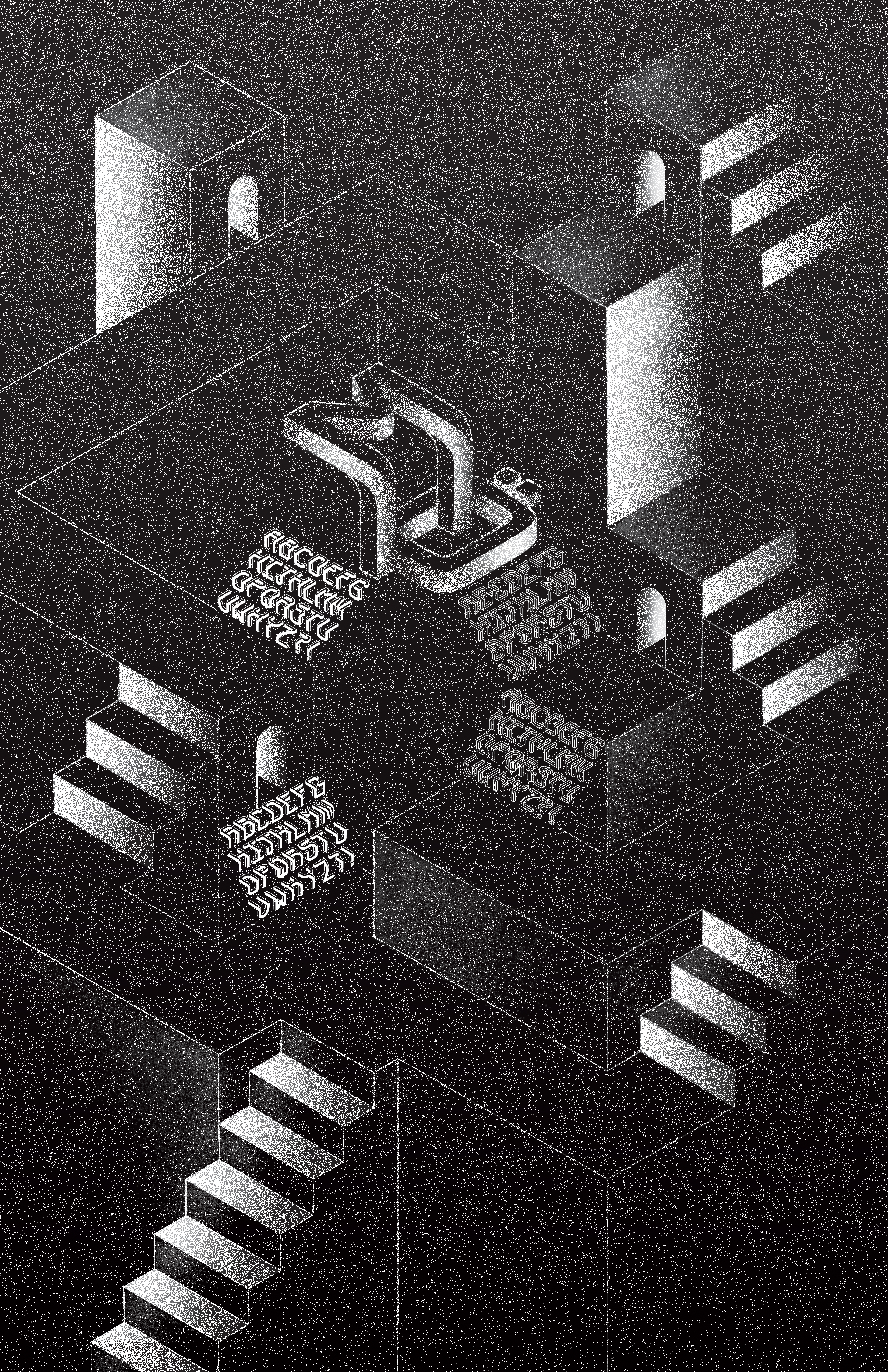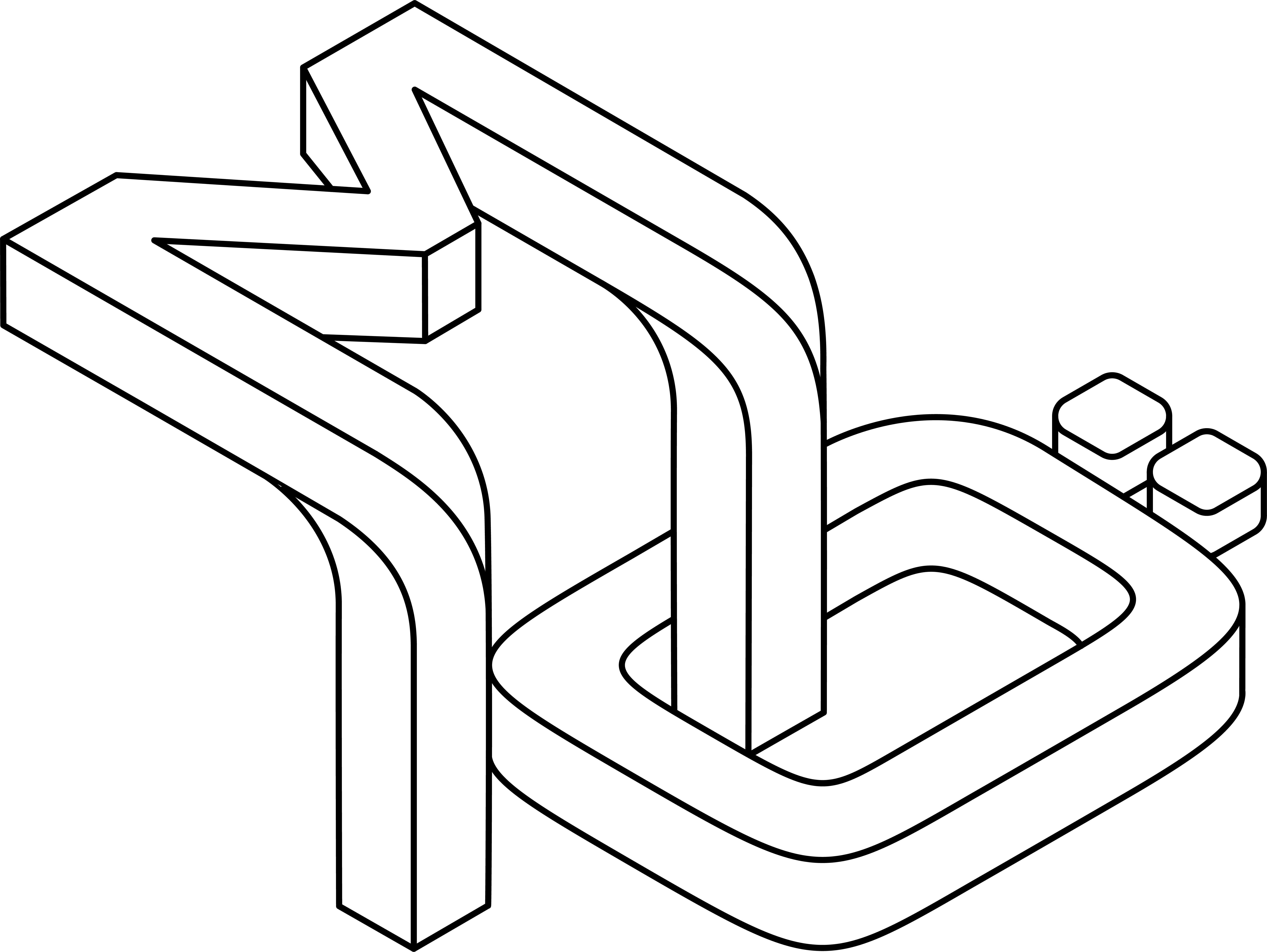
Mö is a display typeface inspired by the impossibility of M.C. Escher’s artwork and the Möbius Strip (where its name originates from). Each character melts two perspectives into one and sits on an isometric grid.
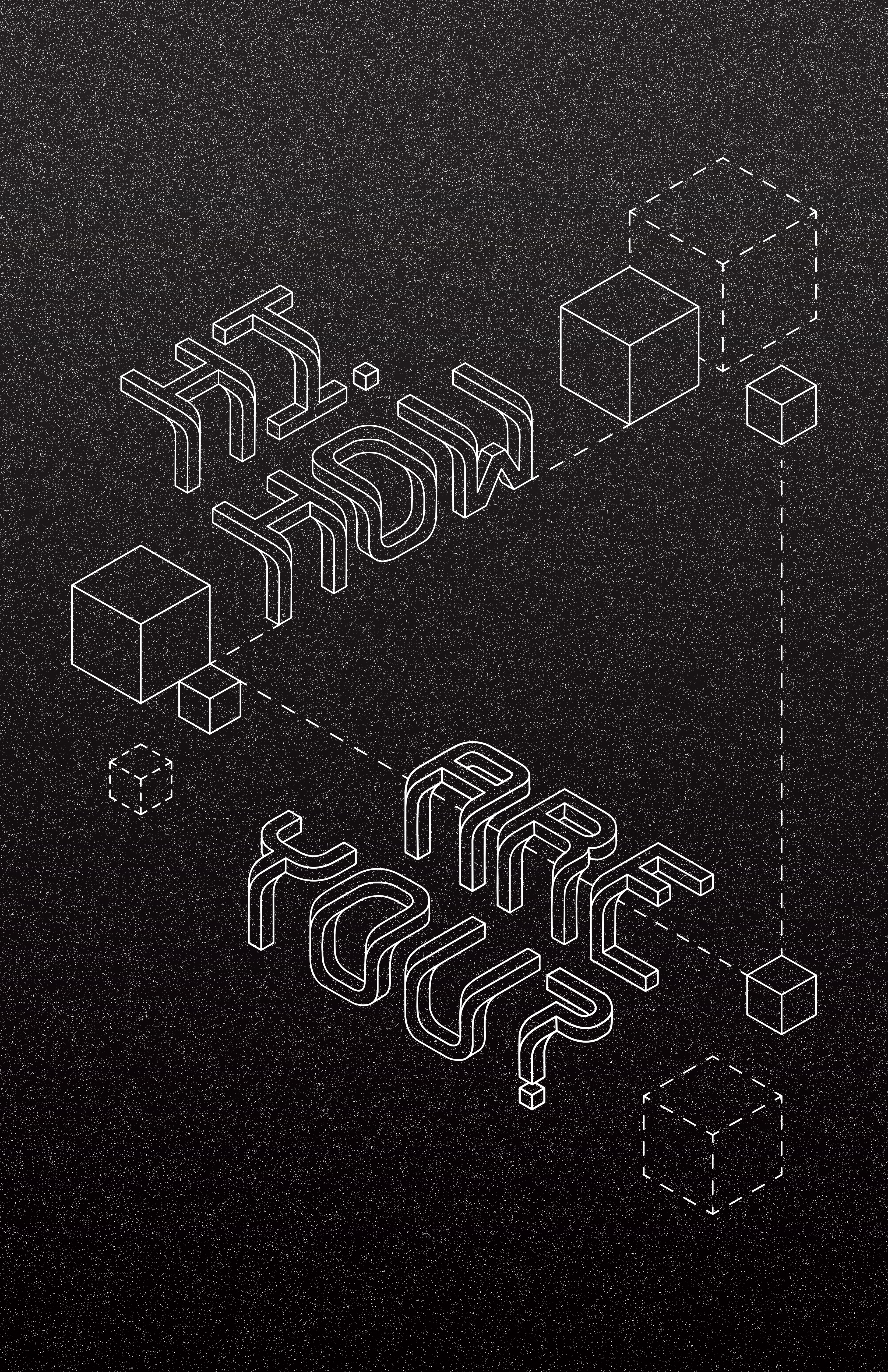
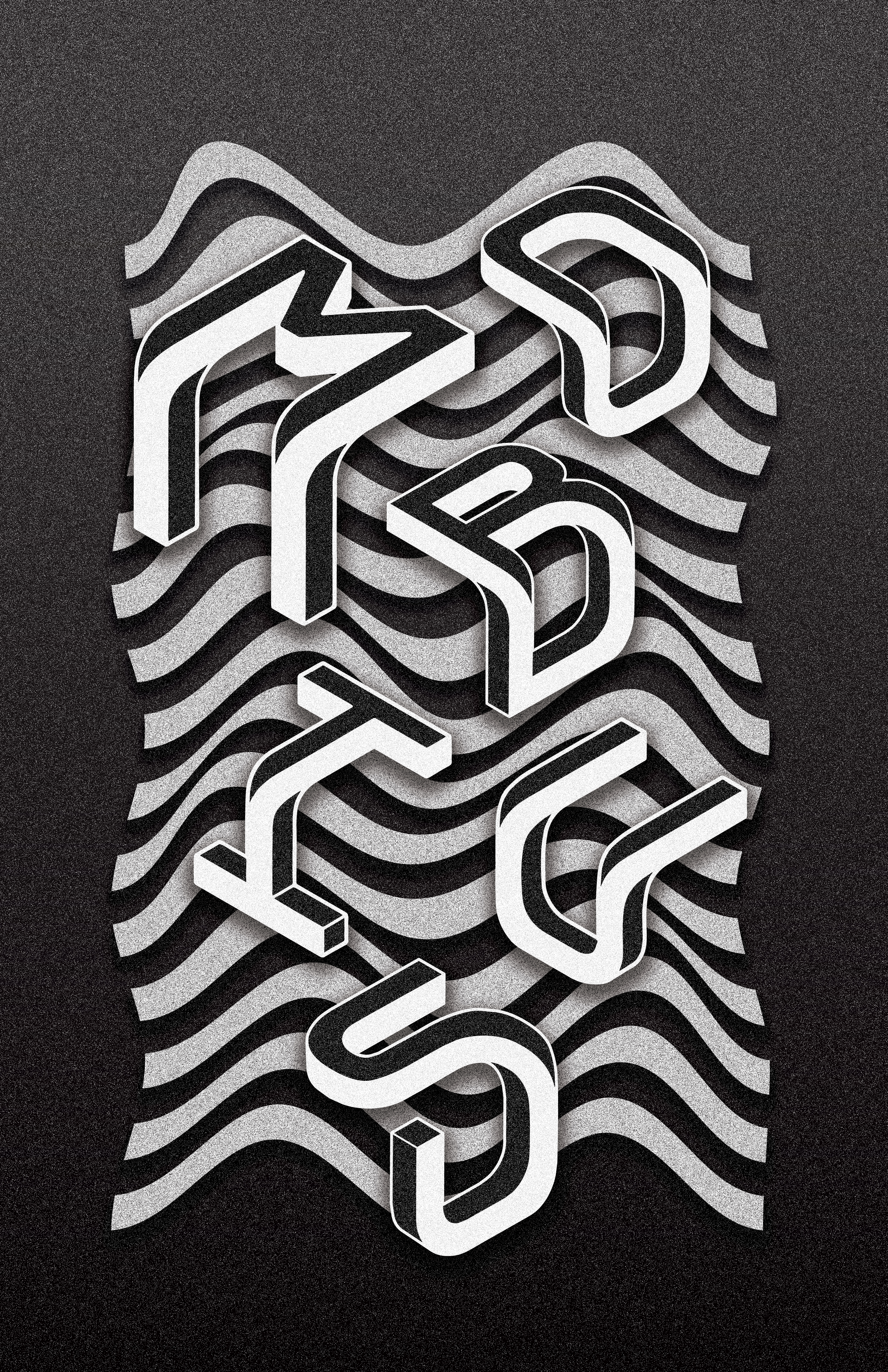
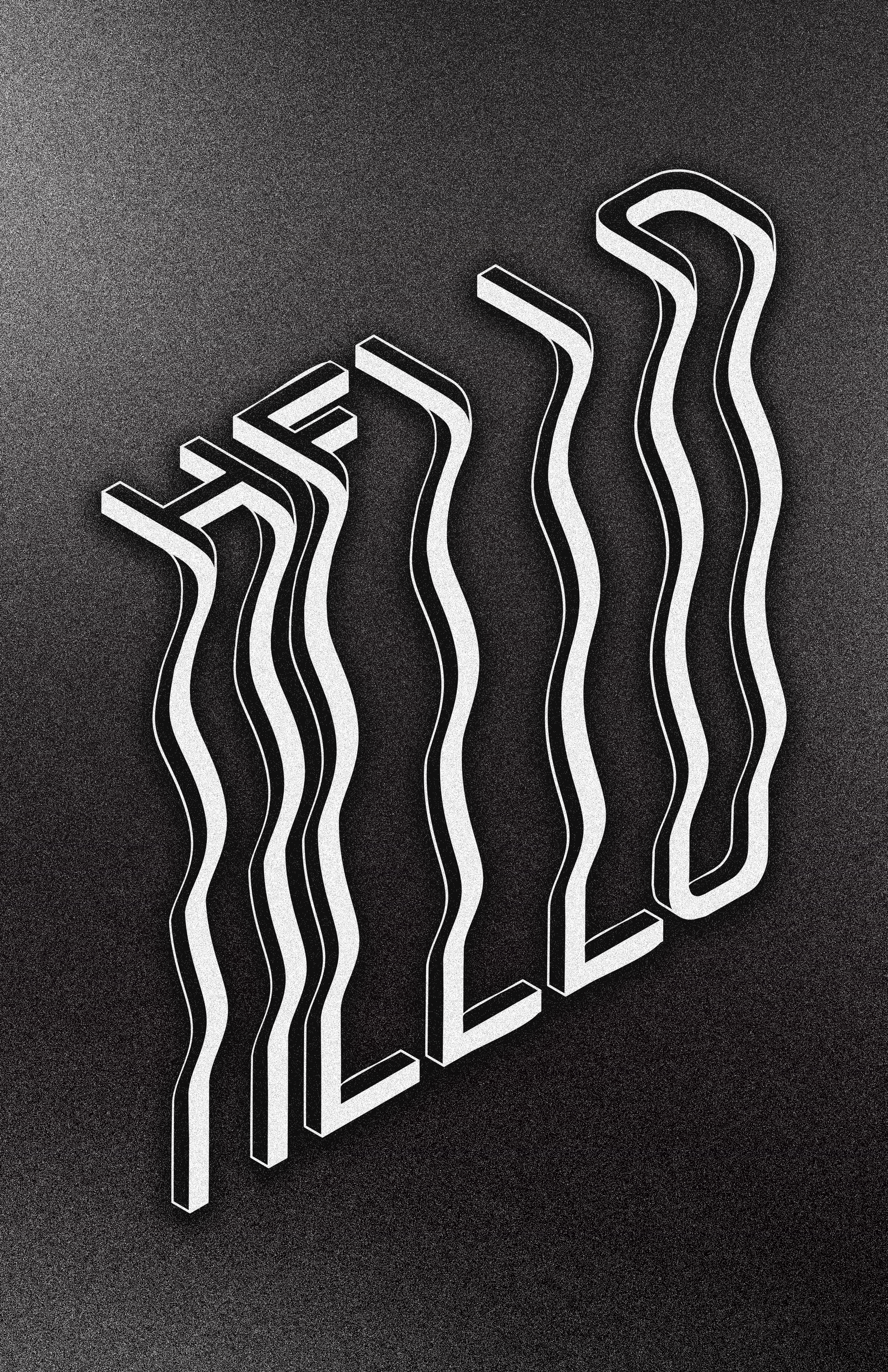
M.C. Escher was the master of impossibility and often portrayed themes of perspective, symmetry, reflection and infinity in his work. Escher was greatly inspired by architecture and toying with perspective which heavily influenced his art later in life and resulted in masterpieces such as Waterfall and Relativity. Mö is a modern simplification of the principles that Escher used in his art work. Similar to Escher’s work, Mö will depict many perspectives at once in way that’s both minimal and mind-bending while maintaining legibility. Below are a few examples of the font in use.
